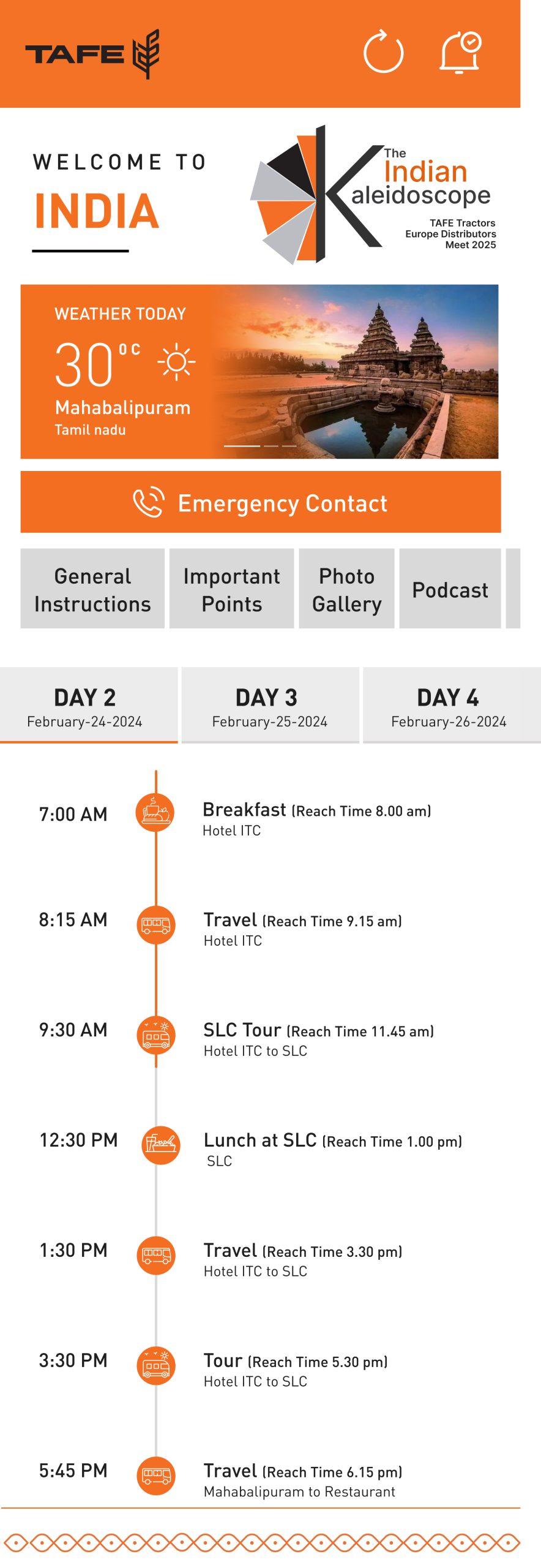
Amazon Creative Case Study
KRDS x Amazon Home
How We Turned Categories Into Characters. And Storefronts Into Stories.
A not-so-serious case study of a very serious makeover.
🏠 Prologue – The Home That Looked… a Little Meh
Amazon had it all:
A fridge that sings (almost)
A treadmill that folds better than fitted bed sheets
A tap with pressure strong enough to launch a coconut
But the homepage?
Looked like I skipped breakfast.
That’s when KRDS walked in — not with a hammer, but with a mouse.
Our mission?
Turn Amazon Home into a digital home makeover show.
Except the curtains were product carousels. And the drama was fully clickable.
🔧 Act 1 – Enter the Category Characters
We didn’t see verticals. We saw personalities.
Each category had a vibe. A mood. A love language.
| Vertical | Vibe Check |
| Kitchen | MasterChef meets Pinterest board. Made pressure cookers look premium. Even gave chimneys personality. (They’re shy. They suck quietly.) |
| Home Improvement | Screws, drills, and DIY drama. Made a screwdriver look sexier than your ex. |
| Sports | TT racquets got their Rocky montage. Created pages that yelled “fitspo!” without the sweat. |
| Large Appliances | Gave fridges more screen time than most influencers. ACs became cool in every sense. |
| Furniture | From plastic chairs to statement sofas — every store page screamed “adulting, but aesthetic.” |
| MiniTV | Because nothing says “binge-worthy” like watching shows and buying the lamp in the background. Cross-selling? Cross-winning. |
🎨 Act 2 – Design, With a Dash of Masala
Let’s be honest. Most e-comm pages look like they were built by Excel.
Not these.
We designed with:
Flavor – Text that sells without shouting
Flow – Layouts smoother than melted Amul butter
Logic – Because nothing ruins a sale like confusion and Comic Sans
Examples?
- Buying guides that didn’t feel like tax forms
- Category pages that had more structure than our fitness plans
- Lifestyle visuals that made even a mop look aspirational
One user said:
“I came for a pressure cooker. I left with a Wishlist, a yoga mat, and a new personality.”
📈 Act 3 – Results (aka The Part With Numbers)
| Metric | What Happened |
| 👀 Page Scrolls ↑ | Users scrolled like it was Instagram. But with less envy and more EMI options. |
| 🛍️ Add-to-Cart ↑ | Conversion rates rose. So did eyebrows. (“Wait, this site looks… good?”) |
| 🧠 Time Spent ↑ | Users stuck around. Some forgot what they came for. (“Did I need a dishwasher? Who cares, add to cart.”) |
| 😎 Client Feedback | “Guys… this slaps.” – said someone, somewhere, maybe, definitely. |
🧼 Epilogue – What We Really Built
We didn’t just make pages.
We made experiences.
Storefronts with soul.
Furniture that flirted.
Chimneys that told stories.
Category banners that said, “Hey. We’re hot. And in stock.”
All stitched into the Amazon CMS like pros who’ve done this a hundred times.
(Which, modestly, we have.)
🎤 Final Sign-Off
This isn’t just e-commerce.
This is e-charm, e-chic, and a little bit of e-laughter.
We took Amazon Home from “hmm” to “damn” — and we’re only just getting started.
Want a kitchen that sells itself?
Or a treadmill with better UX than your dating app?
Slide into our CMS. We’ve got ideas.
KRDS
Where creativity meets cart conversions.
Want this as a deck with illustrations? Maybe a voiceover in Shah Rukh’s tone?
Say the word.